Week One.
For this brief, we had to create multiple designs including the use of dynamics and compositions for six different scenarios that were given to us.
Below are the thumbnails and developments of each scenario.
Below are the thumbnails and developments of each scenario.


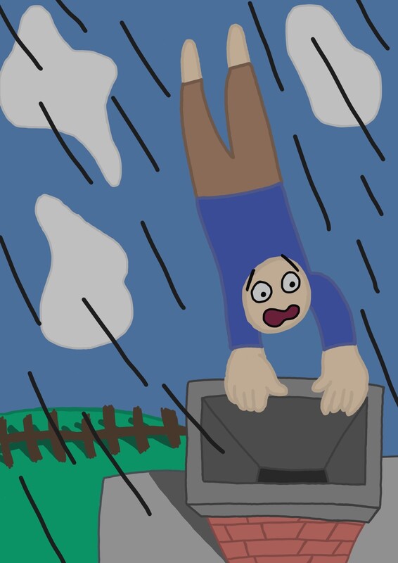
Below are the final designs for each scenario. These were completed digitally because I wanted to experiment with different digital brushes and how much of a difference they made on each design. Overall, I would say the fourth design is my favourite because I like the extra detail on the rocket and the colours work well with each other and it seems like a comic page whereas my least favourite is the second design because it seems too "childlike" for my liking and I feel like further improvement can be made to the person and especially his grip on the chimney.


Week Two.
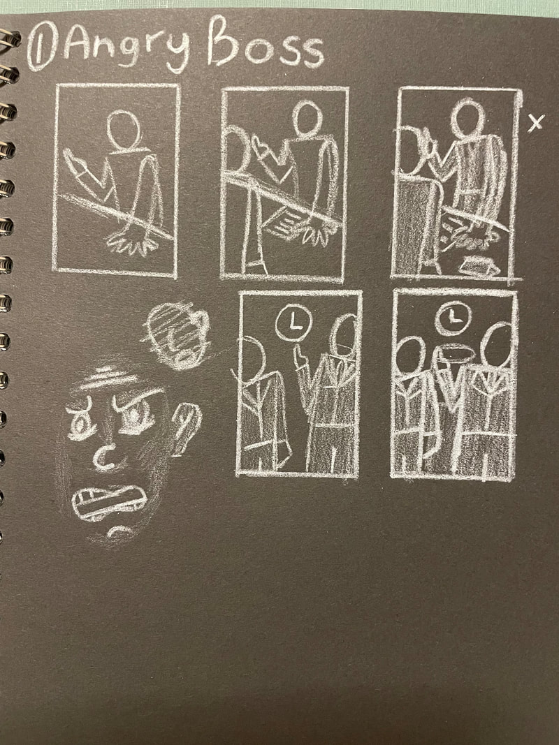
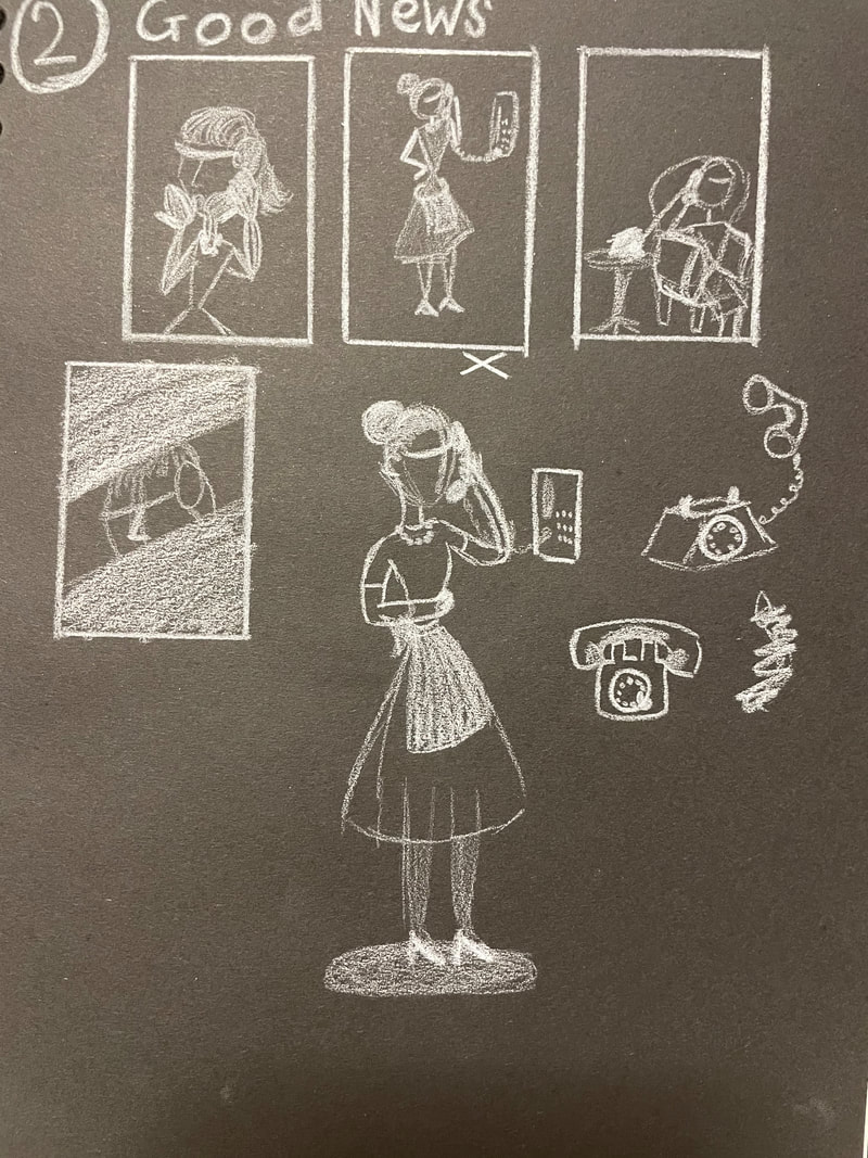
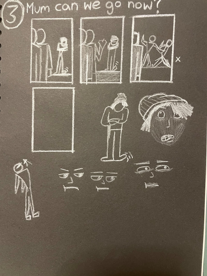
For this brief, it is similar to the first week but instead of focusing on dynamics and composition (whilst still keeping them in mind) we were to focus on body language.
Below are thumbnails and minor developments for each scenario.
Below are thumbnails and minor developments for each scenario.


Below are further developments as well as the final designs. I wanted to complete these using an analogue medium and especially watercolours because I viewed it as the most time efficient method at the time and I wanted to experiment with watercolours because I do not use them often and I wanted to build up my understanding of it and improve. Overall, my favourite would be the first design because I enjoy the use of colour to show the boss's anger and how everything is warm to show his anger whereas the employee is in a cold green to show his calmness, as if this isn't the first time he's been yelled at by the boss but what I think needs to be improved for this piece would be the boss's hand as it is very distorted.


Week Three And Four.
For this brief, we were given a extract of a text and had to create a complete final piece for that text as well as having to have a focus on communicative colour. The text I was given was from "Oh, Whistle, And I'll Come To You, My Lad" by M R James.
Below is a small analysis of certain parts of the text, a few mind maps for colours and a first impression drawing when first hearing what the piece was meant to be about.
Below is a small analysis of certain parts of the text, a few mind maps for colours and a first impression drawing when first hearing what the piece was meant to be about.


Below are the thumbnails and developments of the piece.


Overall, I believe my use of colour went well because I was wanting to use dark yet somewhat pale colours to give the sense of dread and unease which I think I conveyed quite well however to improve, I would want to work more on the buildings on the hill as they seemed very simple and underdeveloped.