Semester One
Project One
|
|
The project was to create an eight-paged comic based around a nursery rhyme with a partner and me and my partner were assigned the rhyme, Humpty Dumpty. We decided to turn the fall into something metaphorical and made it into a fall of status during modern times.
|
Project Two
|
|
The project was to try different mediums and new things to see if we would want to incorporate into our work.
|
Project Three
|
|
The project was to practice perspective, learn or practice new mediums and challenge ourselves and our limits with coming up with a large certain amount of thumbnails.
|
Project Four
|
|
The first half of the project was to practice colour, composition and linear narrative.
|
|
|
This was the second part of Project Four however it is incomplete. The task was to create a booklet showing a chosen song and I chose Wichita Lineman by Glen Campbell. The song is about a lineman who constantly works and longs for more so I had the booklet portray how life is continuing below while the lineman is still on the line watching it all go by. The reason this is incomplete is because I was meant to add the lyrics to the pages however that feature I had forgotten however the slideshow is ordered the way the booklet should have been.
|
Semester Two
Project One
|
|
|
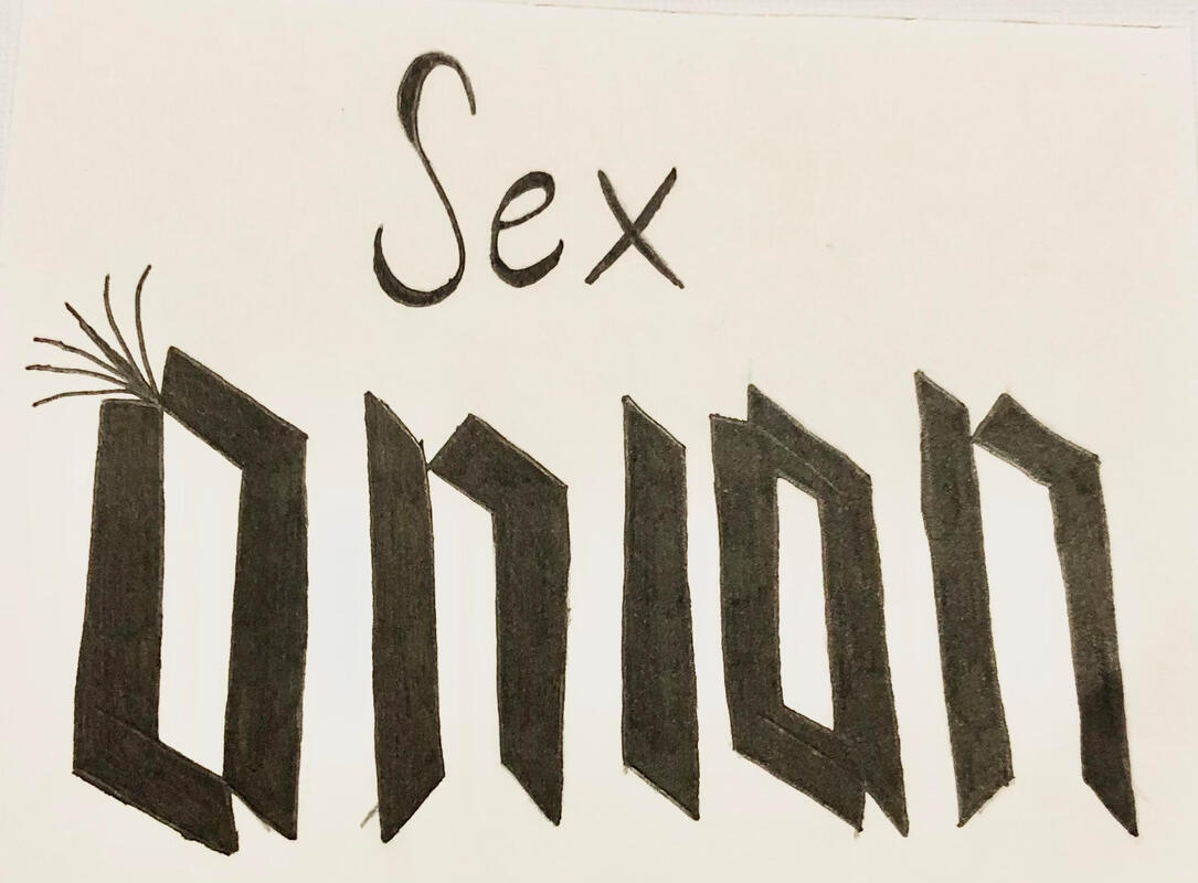
The brief for this project was to create a 2D logo for a fictional band of an assigned name given to us by our tutors.
My band name was Sex Onion. Firstly, I wrote down what ideas and imagery came to mind when hearing the name and decided that the band would be in the rock genre so I had to focus on that sort of imagery. I then went into further research about such things as onions and burlesque. Then I began drawing these ideas to see how they'd look and if it worked well and what could be improved. I later realised that most rock bands don't have an image for a logo but rather type so I began looking what sort of ideas could be used with type to create the logo. Finally, I landed on having my final design be type with the word "Sex" being more rounded and curved to seem more sensual or as if a neon sign like outside of adult shops whereas the word "Onion" being more straight-edged for a more "rock n roll" feel with sprouts coming out of the first "O" to have seem more like an onion. |
Project Two
|
|
|
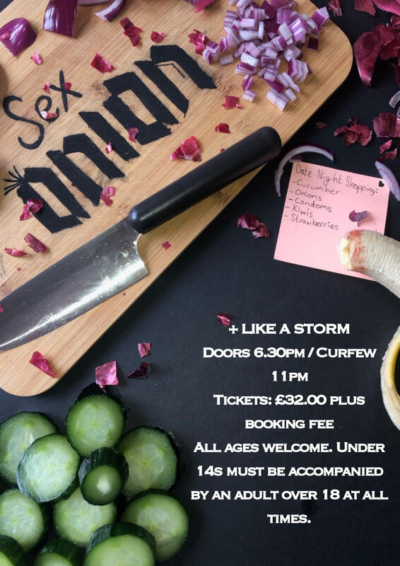
This project was a 3D continuation of the previous one in which I was assigned to now create a 3D poster for a gig for previous fictional band "Sex Onion".
I first sketched up a few ideas as to what the poster could look like then went into experimentation by sewing up a bed sheet with the band name as well as a cushion, the bedsheet being completed with a sewing machine whereas the cushion was hand-stitched. I also painted the band name onto the chopping board to try leaning more into the "onion" part of the name. I then began taking photos to see what worked and what didn't which led me to realising that the images with the chopping board worked best out of all them. I then tried different props for the images and settings to see what worked better and I found that a black background and the knife worked really well compared to a grey background and a wine glass. So after figuring out what worked with the "onion" side, I then began working on the "sex" side but still keeping it tied with the "onion" so I used food such as bananas and cucumbers as well as a small shopping list joke which then gave me my final design. |
Project Three
|
|
This was the final continuation for "Sex Onion" in which I had to create an animation for a song that fitted into the theme and genre of my fictional band. I chose the song "Poison" by Alice Cooper because it seemed suitable for a band with a name of "Sex Onion" such as with the lyrics and genre.
I first annotated the lyrics to try and see what the lyrics meant and what imagery came to mind which then led me to doing a few rough sketches of small imagery from a few select lyrics as well as this I then looked into type and what could be used and colour scheme. I then began figuring out each image for each lyric and finally created a storyboard to plan out the transitions to each image throughout the animation. |