Week One And Two - Photoshop


|
|
|
|
For this task, I was given a band name of "The Barriers Of Boredom" and told to create posters and merch for said band. Firstly, I had to start with thinking of what genre of music would this band play to figure out what sort of imagery can be used. After some consideration and some advice after consulting my peers, I was given the idea of choosing the genre from what music I personally listen to when bored to somewhat refer back to the "Boredom" aspect of the name. The genre of music was then decided as Pop and the three main songs that influenced that decision are shown above as they are some of the main songs I listen to when bored. All three of these songs were also released two years ago so this also influenced my decision that the band were to be more recent and modern.


Next, I decided to see what typeface was most commonly used within the pop genre. I noticed they mostly seem to use sans serif and I also rather liked the newspaper/magazine cutout font and wanted to try experimenting with it.

These are my first sketches, based mostly off of the album covers further above.
The first sketch is meant to be a ripped piece of paper (the tear meant to help represent the barrier), the side with "Of Boredom" is to be in greyscale and have the words of the band name be made of newspaper clippings and have the other writing on that side so that the viewer's eye will go from the top left corner to the bottom right. The side with "The Barriers" is to be in magazine clippings and in colour but kept simple with scribbles in the top left corner to try to balance out the writing in the bottom right.
The second sketch is of a wall that is meant to be the barrier that is keeping back the boredom that is behind the wall. The background behind the wall and the writing is to be dull and grey whereas the wall and the foreground are to be in colour including the band name which is to look like a type of graffiti.

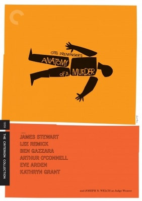

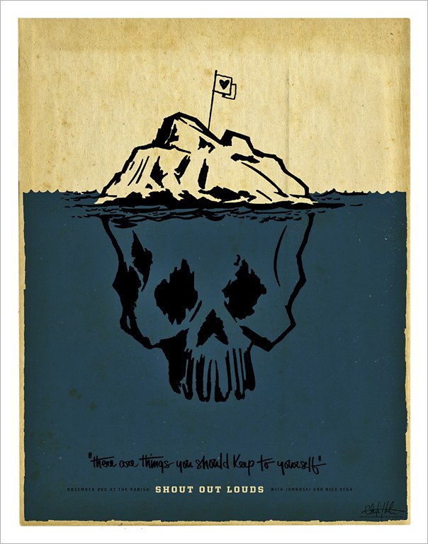


These posters were created by the artists, Saul Bass, Christian Helms, Olly Moss and Andrio Abero.
The similarities between the artists' posters is that they all seem to have a simple colour palette and that most of them seem to involve silhouettes or some sort of simplistic imagery to a certain extent. I think this makes them more visually appealing as they stay in your mind more and ergo more memorable to the viewer.
The similarities between the artists' posters is that they all seem to have a simple colour palette and that most of them seem to involve silhouettes or some sort of simplistic imagery to a certain extent. I think this makes them more visually appealing as they stay in your mind more and ergo more memorable to the viewer.


These posters were made in 2021 which is when I have my band situated. From what I can tell, the two posters on the ends don't seem to have anything to do with the name of their band at all which is actually something I had forgotten could be done and perhaps trying to as though for a certain song or how they're music makes the listener feel so perhaps I could look into more music that seem like what the band would make to try and figure out more of the sense and feel I would like to go for to get more ideas for the posters and merch.


These new sketches were created after the research was made.
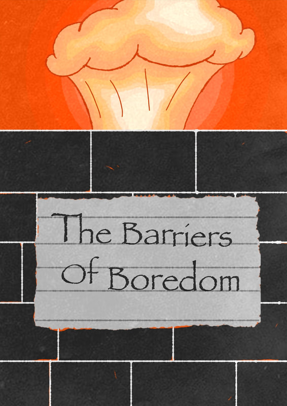
The first sketch is more so based on how the music makes the listener feel as it's mostly rather angry, "ex people-pleaser", confidence boosting songs so I thought something like an explosion would best represent that burst of rage and confidence but whilst still keeping slightly with the band name to tie it all back to it, there is a wall with barbed wire (maybe silhouetted) to be like a blockage stopping the listener from reaching this confidence and keeping them in this state of boredom but that maybe this music would help them break that barrier. The colour palette is to be simple with mostly black and white for the wall and sign whereas the explosion and the background are to be in vibrant and warm colours like red, orange and yellow to further emphasise that sense of rage but also a hint of power that the band's music could give them.
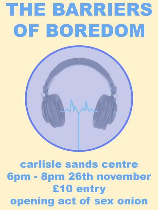
The second sketch is a more simple design. I wanted it to seem as though the barrier is the bubble and it was being created from the music of the band coming from the headphones as though the music is protecting the listener from boredom.
The first sketch is more so based on how the music makes the listener feel as it's mostly rather angry, "ex people-pleaser", confidence boosting songs so I thought something like an explosion would best represent that burst of rage and confidence but whilst still keeping slightly with the band name to tie it all back to it, there is a wall with barbed wire (maybe silhouetted) to be like a blockage stopping the listener from reaching this confidence and keeping them in this state of boredom but that maybe this music would help them break that barrier. The colour palette is to be simple with mostly black and white for the wall and sign whereas the explosion and the background are to be in vibrant and warm colours like red, orange and yellow to further emphasise that sense of rage but also a hint of power that the band's music could give them.
The second sketch is a more simple design. I wanted it to seem as though the barrier is the bubble and it was being created from the music of the band coming from the headphones as though the music is protecting the listener from boredom.
|
This is my first draft for a band poster.
|
|
Workshop Pause

|
This to the left is a small task given during a workshop session to create a worn out wrestlers collection card.
|

|
This is my second draft for the poster however this time I went with a different sketch and I wanted to focus on extra details and font a little more this time.
First, I went onto IbisPaint X and drew the poster but left out the writing because I thought I could find better fonts on photoshop rather than on the app. I chose this colour palette because I wanted the background to be eye-catching whilst the barrier was to be simple and in greyscale to emphasise the "boredom" aspect, as if the boredom is stopping the view from witnessing something interesting. Second, went onto Photoshop and began testing out sizes and fonts to see what suited it best and I ended up picking "Papyrus" because it allowed the letters to be off-centre whilst still looking appealing compared to the others. I then wanted the poster to have the texture of one had been around for some time but still recent so it's not fully aged. So, I went online and found a simple poster texture and placed it on top whilst also changing the opacity a certain amount so the texture didn't become too distracting. Finally, I wanted the poster to seem as though it was on the wall. To do this, I first shrunk the poster so I could colour the background and then went online to find a wall texture. I found one that I liked and then placed it above the background layer and then edited the opacity so the colour could come through. Afterwards, I added a drop shadow to the poster to give the poster a 3D sort of feel. |


Week Three And Four - Illustrator


For this task, we were told to choose a already existing object or franchise and to make a parody of it that you could market. We were to create three enamel pin designs and backings. I chose the franchise of the stop-motion animation called Laika Studios that created such films as Coraline, Paranorman and The Boxtrolls.


|
|
|

