Week One - Ink Work


For this task, we were looking at ink works and the techniques by looking at different artists and taking some element from their work and placing it into our own. The chosen artists above are Edward Gorey, Chris Ware and Lucinda Rogers.
I chose Edward Gorey for his use of greyscale and the technique of purely using lines in a slight scribble-like manner to create tone, shadow and partial depth. I chose Chris Ware for his use of painting with the ink and how he creates tone by doing so. I chose Lucinda Rogers for her use of not staying within the lines with her colours and how some lines overlap each other as I believe it somewhat shows how the world around us can blend together.
I chose Edward Gorey for his use of greyscale and the technique of purely using lines in a slight scribble-like manner to create tone, shadow and partial depth. I chose Chris Ware for his use of painting with the ink and how he creates tone by doing so. I chose Lucinda Rogers for her use of not staying within the lines with her colours and how some lines overlap each other as I believe it somewhat shows how the world around us can blend together.


Above are experiments for becoming comfortable with ink. I mostly used pigment liner except for the last piece where I used a brush and ink. All except the last two were completed with the actual object being in front of me whereas the last two were completed from scratch. Overall with these experiments, I would say that they helped me with my shading as well as helping me with a refresher for perspective. Out of all the experiments, the ones I prefer the most is the tree and the lamp because the tree has a certain amount of detail along the trunk that makes it rather appealing and I like the shading on the lamp because it's the added detail of the curvature of the lamp's head and the shadow of the dimmer.

Above are my portrait pieces, one being a combination of pigment liner and brush and ink whereas the other is solely pigment liner. While the pigment liner on the first piece is more smooth compared to the second, the brush ink work lets the piece down due to the smudging, the ink coming too far out of the lines with the hair and the ink colouring the neck is all over the place so if i were to try again I would try to have more control of the brush and therefore the ink as well as maybe fade the colour on the neck as well because it seems too vibrant compared to the rest. The second piece is okay however it seems very flat and the shading on the neck is a little too attention grabbing compared to the rest, in my opinion.


Above is my final piece being a corner of my room using both pigment liner and brush and ink. Overall, I would say it has gone well because the shading looks appealing and there is a slight sense of perspective, the use of greyscale is good and I think if I were to use other colours then it would either blend together too much or make the piece seem too busy so keeping it grey was a good decision. If I were to improve, I would work more on the lines because they're not really as straight as I would've liked them to be and I would try to make the piece seem a little more 3D as it's a little flat.
Week Two - 3D Illustration


For this task, we were creating animals from discarded materials such as empty plastic bottles, cardboard, string, etc. The aim of this project was to capture the essence of the animal, for example with Picasso's piece of a Bull's Head but it is composed of simply a bicycle seat. Above are examples of work from Picasso and Alan Fletcher.


The animal at the top is a dog. The dog is composed of a lunchables container, some cardboard, a food container and two pieces of tights. I attempted to capture the essence of a dog by having the piece seem as though it's a dog laying down and you're looking at them from the front, therefore the ears would be at the side drooping down and the paws would be at the front.
The animal at the bottom is a mole. The mole is composed of a empty juice bottle, some cardboard, a few pieces of thread and masking tape. I attempted to capture the essence of a mole by not giving it eyes as moles are known for being blind and keeping the animal small since moles can be around five to seven inches long.
The animal at the bottom is a mole. The mole is composed of a empty juice bottle, some cardboard, a few pieces of thread and masking tape. I attempted to capture the essence of a mole by not giving it eyes as moles are known for being blind and keeping the animal small since moles can be around five to seven inches long.
Week Three - Painting


For this task, we chose a four artists who either worked with watercolour, acrylic or oil paints and, similar to the ink works, we were to take elements of their work and technique and attempt to implement them into our own. The two acrylic artists I chose were Jack Teagle and Jenny Saville. The two watercolour artists I chose were Gabriel Picolo and the other artist didn't give a proper name except their instagram of "Paintingsbyrujuta".


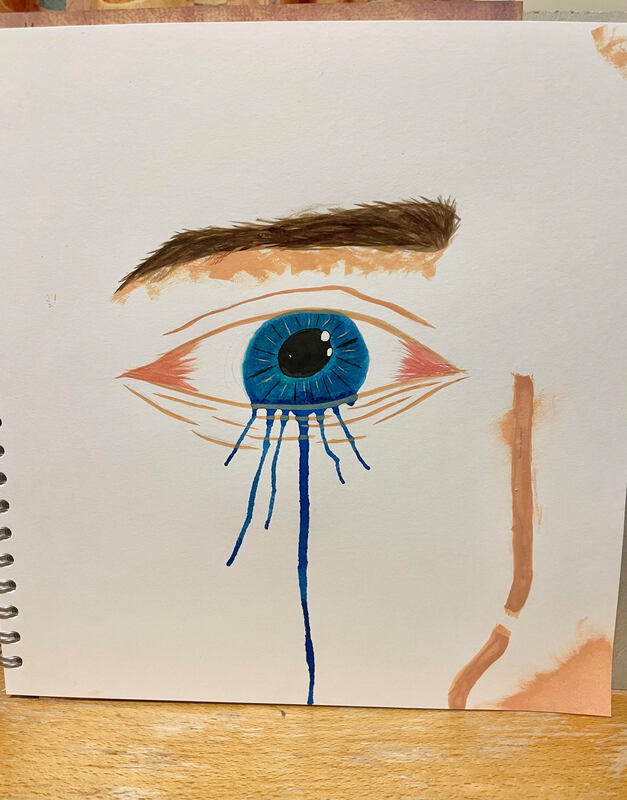
The first piece is a watercolour with the attempt of implementing the work of Gabriel Picolo. I tried to implement his work by adding the outline as well as trying to keep to a paler colour palette. I would say the outline is quite alright however in some areas the watercolour blends into others so next time I need to be more patient and wait for one colour to dry enough to where I can paint in a different colour and it not mix. I also think I should work more on shading as some areas are difficult to tell if they are meant to be darker than others.
The second piece is a watercolour with the attempt of implementing the work of Paintingsbyrujuta. I tried to implement their work by the lack of outline as well as trying to have it seem a bit more realistic. The paint unfortunately blends too much together and the shadows haven't worked either as it makes the piece feel flat and you cannot tell where the object itself begins nor ends. If I were to do this piece again, I would work more on differentiating the shadows more so you could tell where the object starts and I would be more patient and wait for the first colour to dry before starting a new one so there isn't any accidental blending.
The third piece is an acrylic with the attempt of implementing the work of Jack Teagle. I tried to implement his work by trying to keep that cartoon feel of it and keeping it flat as well as using the lack of outline. The colours work well together and the shadow is quite nice however I could've worked more on the darker outlines such as maybe had them give more of a sense of direction or perhaps kept them all the same width since some seem to change widths as the line continues.
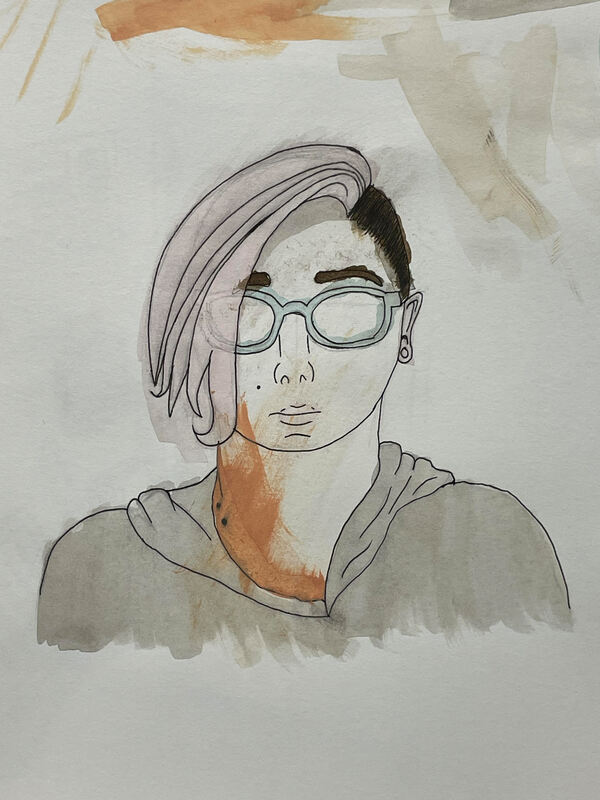
The fourth piece is an acrylic with the attempt of implementing the work of Jack Teagle once more. This time I tried to implement his work onto a portrait piece of a photo of my friend. I continued with wanting to keep the cartoon feel as well as the sense of flatness of the piece with an attempt of having no outline. I think that while the colours look vibrant and you can tell at least that this is meant to be a person, I feel that to improve I could've maybe tried more to hide that pencil outline or perhaps tried to have more control over the paintbrush.
This fifth piece is an acrylic with the attempt of implementing the work of Jenny Saville. Jenny Saville is known for her work being very focused on skin so I attempted to focus on the same thing and painted my notebook that is of the film "Hocus Pocus" in which the spell book is meant to be said that it is made of skin. Unfortunately, what I have learned and aim to now improve is that I find it difficult to create skin tones and struggle to build upon the layers of colour due to a lack of understanding that I shall strive to fix.
The second piece is a watercolour with the attempt of implementing the work of Paintingsbyrujuta. I tried to implement their work by the lack of outline as well as trying to have it seem a bit more realistic. The paint unfortunately blends too much together and the shadows haven't worked either as it makes the piece feel flat and you cannot tell where the object itself begins nor ends. If I were to do this piece again, I would work more on differentiating the shadows more so you could tell where the object starts and I would be more patient and wait for the first colour to dry before starting a new one so there isn't any accidental blending.
The third piece is an acrylic with the attempt of implementing the work of Jack Teagle. I tried to implement his work by trying to keep that cartoon feel of it and keeping it flat as well as using the lack of outline. The colours work well together and the shadow is quite nice however I could've worked more on the darker outlines such as maybe had them give more of a sense of direction or perhaps kept them all the same width since some seem to change widths as the line continues.
The fourth piece is an acrylic with the attempt of implementing the work of Jack Teagle once more. This time I tried to implement his work onto a portrait piece of a photo of my friend. I continued with wanting to keep the cartoon feel as well as the sense of flatness of the piece with an attempt of having no outline. I think that while the colours look vibrant and you can tell at least that this is meant to be a person, I feel that to improve I could've maybe tried more to hide that pencil outline or perhaps tried to have more control over the paintbrush.
This fifth piece is an acrylic with the attempt of implementing the work of Jenny Saville. Jenny Saville is known for her work being very focused on skin so I attempted to focus on the same thing and painted my notebook that is of the film "Hocus Pocus" in which the spell book is meant to be said that it is made of skin. Unfortunately, what I have learned and aim to now improve is that I find it difficult to create skin tones and struggle to build upon the layers of colour due to a lack of understanding that I shall strive to fix.